Part 05 · Field Book
Design Disciplines
Design as visual practice — graphics, typography, illustration, UX, motion, space, product.
If art is an inquiry into the nature of experience, design is the discipline that organizes that experience into legible structures. It exists in the narrow, pressurized space where visual craft meets the demand of utility—a practice of making that is answerable not only to the eye, but to the hand, the room, and the clock. To move through the following chapters is to examine how the plastic concerns of the artist are reconfigured into the tools of the citizen, shifting from the open-endedness of the gallery to the specific, governing logic of clarity, function, and use.
In this part · 7 chapters
Graphic design
Graphic design is the discipline of organizing visual information to render a message clear, persuasive, and memorable. While it shares a lineage with the fine arts, it operates under a different contract with the viewer. Where a painting may revel in ambiguity or the deeply personal, design is fundamentally an act of service to communication. If a layout is aesthetically breathtaking but conceptually opaque, it has failed its primary objective. In design, beauty is not an end in itself; it is the lubricant that allows information to slide into the mind of the public.
To achieve this, the designer relies on a set of structural principles that govern the movement of the eye. The most vital of these is hierarchy. Without a clear path of importance, a page is merely a field of noise. By manipulating size, weight, and contrast, the designer tells the viewer where to look first, second, and last. In a concert poster, for instance, the band’s name acts as the anchor, followed by the venue and date, with the granular details of ticket prices or URLs relegated to the periphery. This spatial logic is supported by the use of contrast—the friction between large and small, light and bold, or saturated and muted—which prevents the composition from collapsing into a flat, undifferentiated mass.
Effective design also requires a rigorous sense of order, typically achieved through alignment and proximity. By anchoring elements to an invisible grid, the designer creates a sense of professional intentionality; random placement, by contrast, feels amateurish and chaotic. Proximity serves a psychological function, grouping related items to imply a relationship—a concept borrowed from Gestalt psychology. When combined with repetition—the consistent use of color, shape, or motifs—these elements build a visual language that feels unified and authoritative.
Typography and the Voice of the Word
If design is the body, typography is the voice. The arrangement of type is an art form that carries semantic weight independent of the words themselves. The choice between a serif and a sans-serif typeface is not merely a stylistic one; it is an ideological one. Serifs—the small decorative strokes at the ends of letterforms found in classics like Garamond or Baskerville—convey tradition, authority, and the steady breath of long-form reading. Sans-serifs, such as the ubiquitous Helvetica or the geometric Futura, speak the language of modernity: clean, neutral, and occasionally sterile.
The history of type mirrors the history of technology and humanism. We see the ornate, compressed Gothic of the Gutenberg era giving way to the organic, hand-modeled Humanist styles of the Renaissance. By the late eighteenth century, the high contrast and vertical stress of the Didone style, exemplified by Bodoni and Didot, brought a sense of dramatic elegance that remains the hallmark of high-fashion editorial. Later, the Industrial Revolution introduced the sturdy, mechanical Slab Serif, while the twentieth century saw the rise of the Swiss International Style, which championed the grid and the objective clarity of Neo-grotesque sans-serifs.
In practice, typography requires a balance between legibility and expression. For body text, the designer prioritizes the "invisible" quality of type—ensuring the reader is never distracted by the mechanics of the letterform. This involves careful attention to leading (the vertical space between lines), kerning (the adjustment of space between specific letter pairs), and tracking. However, in display typography—headlines, logos, or posters—the designer may sacrifice ease of reading for emotional impact. A word like "LOUD" set in a delicate, spindly script becomes an ironic statement, whereas the same word in a heavy, condensed Blackletter feels like a physical assault.
The Grid and the Identity
Underlying most successful design is the grid—a mathematical framework of columns, modules, and gutters. The grid is the architect’s blueprint for the page. It provides a structure for efficiency and consistency, particularly in multi-page publications like magazines or books. The Swiss masters of the 1950s, such as Josef Müller-Brockmann and Armin Hofmann, pushed grid-based design to its logical extreme, creating works of cold, geometric clarity that still define the "corporate" aesthetic of entities like IBM.
Yet, a grid is most powerful when it is understood well enough to be broken. In the 1990s, David Carson famously rejected the rigidity of the Swiss school with Ray Gun magazine, creating anarchic, nearly illegible layouts that reflected the fractured energy of grunge culture. Between the clinical precision of the grid and the total chaos of the anti-grid lies the most sophisticated design work: a layout that establishes a rhythm only to interrupt it strategically for emphasis and surprise.
This balance of consistency and impact is the cornerstone of branding. A brand is a visual ecosystem meant to represent the values of an organization through a cohesive language of logos, color palettes, and typography. A successful logo—think of the Nike "Swoosh" or the Apple silhouette—must be simple enough to be recognizable at the size of a postage stamp yet evocative enough to carry the weight of a multi-billion dollar heritage. When a brand loses this thread, as the Gap did during its ill-fated 2010 redesign, the public feels a visceral sense of betrayal.
Whether applied to a branding system, a political poster, or a complex editorial layout, the designer’s task remains the same: to act as a bridge between a sender and a receiver. By navigating the tension between the constraints of the grid and the expressive potential of the image, the designer turns the raw material of information into the refined currency of communication.
For the artist, this is not a distant discipline. Composing an exhibition poster, a catalogue spread, or the layout of your own website asks for the same hierarchy management as composing a painting: what enters the eye first, what second, what carries the argument.
Diagnostic questions, for your own studio: Open the last poster, invitation, or web page you made for your work — where does the eye go first, and is that where you wanted it to go? Is the typography carrying the same intent as the images it sits beside, or is it borrowed from a template that argues against them?

Moulin Rouge: La Goulue, 1891
Henri de Toulouse-Lautrec · Colour lithograph poster
Type, image, and flat colour organised for the street: modern graphic design begins here, at hoarding scale.
Musée Toulouse-Lautrec, Albi · Source

JOB cigarettes, 1896
Alphonse Mucha · Colour lithograph poster
Art Nouveau's proposition: that advertising could be beautiful without being modest, and that the ornament was as much the message as the product.
Various (widely reproduced) · Source
Typography
Typography is perhaps the most deceptive of the visual arts; it is both a utilitarian delivery system for information and a potent, often invisible, carrier of cultural and emotional meaning. Most viewers treat text as a transparent window through which they peer at ideas, yet the shape of the window itself—the weight of its frame, the tint of its glass—irrevocably alters the view. In the practice of design, typography is not merely an ornament applied to a message. It is the message’s voice, its physical posture, and its primary visual material.
The most fundamental task of typography is the establishment of a readable hierarchy. A layout without a clear order of operations is a room where everyone is shouting at the same volume. To design is to choreograph the viewer’s eye, guiding it from the most urgent information to the most granular. This is traditionally achieved through differentiation: the headline, typically the largest and most assertive element, functions as an invitation or a signpost, often sacrificing the dense legibility required of smaller text for sheer graphic impact. Below it, subheadlines provide the necessary bridge, breaking the monotony of the page and offering context. The body text occupies the role of the workhorse—its size and weight must be optimized for sustained attention, favoring comfort over flair.
There is a mathematical elegance to this structural order. Many designers look to classical proportions—the golden ratio of 1:1.618, or the "perfect fifth" interval of 1:1.5—to determine the relationship between these levels of information. When these ratios are applied correctly, the page feels balanced, even to the untrained eye. A useful diagnostic for the strength of a layout’s hierarchy is the "squint test": when the details of the words blur, does the underlying structure of importance remain visible? If the page dissolves into a grey, undifferentiated soup, the hierarchy has failed.
Beyond the scaffolding of hierarchy lies the more elusive realm of typographic expression. Typefaces are rarely neutral; they are historical artifacts, carrying the baggage of the eras and ideologies that birthed them. Garamond and other humanist serifs carry the refined, literary air of the Renaissance, whereas a geometric sans-serif like Futura speaks of the Bauhaus, the machine age, and a specific brand of retro-futurism. To choose a typeface is to cast an actor in a role.
Some fonts have become so ubiquitous that they have attained a kind of iconic status, for better or worse. Helvetica is the quintessential modern cipher—clean, corporate, and ostensibly neutral, though its critics argue that its ubiquity has rendered it bland. Conversely, Times New Roman serves as the default voice of the institutional and the academic; it is authoritative, yet it carries the slight fatigue of a style that has been used by everyone for everything. Then there are the pariahs of the type world, such as Comic Sans or Papyrus. Their failure is usually not one of design, but of context. These fonts signify a strained attempts at casualness or "ancient" gravitas that often feels misplaced, proving that the most fatal error a designer can make is a mismatch between the tone of the typeface and the intent of the content. A law firm attempting to look innovative in Impact or a techno club branded in Baskerville creates a cognitive dissonance that the viewer senses immediately, even if they cannot name the source of their unease.
The Human Hand and Digital Precision
While the digital library offers an infinite array of pre-made fonts, there remains a distinct power in custom lettering and calligraphy. In an era of pixel-perfect replication, the hand-drawn letter introduces a sense of the singular and the human. Hand-lettering is an act of illustration; it allows for an integration of text and image that a standard font cannot achieve. Whether it is the formal, disciplined strokes of Copperplate calligraphy or the aggressive, urban vernacular of graffiti, the hand-drawn mark carries the energy and the specific physical movements of its maker.
The revival of traditional crafts like sign painting and brush lettering suggests a growing fatigue with digital perfection. These forms value the nuance of the imperfect—the slight wobble in an enamel stroke or the varying pressure of a brush pen. When a designer translates these hand-drawn forms into the digital space, the challenge is to preserve that texture—to resist the urge to over-clean the vectors until the character is polished away.
Ultimately, to master typography is to develop a sensitivity to the rhythm of letterforms. It requires a study of stroke order, proportion, and the negative space between characters known as kerning. Whether one is constructing a grid of mathematical precision or sketching a gestural lyric by hand, the objective remains the same: to ensure that the visual form of the language is as expressive, as considered, and as intentional as the words themselves.
For the artist, type is not neutral packaging. The font on your exhibition vinyl, your artist statement, the spine of your catalogue — each carries as much ideological weight as a brushstroke. A Bodoni statement announces itself very differently from a Courier one, whatever the words say.
Diagnostic questions, for your own studio: Read your artist statement aloud, then look at the typeface it is set in — are they saying the same thing, or is one contradicting the other? If a viewer read only your wall label, in that font, at that size, what would they assume about the work before they turned to look at it?
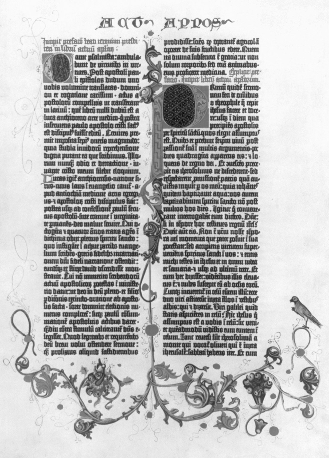
Illuminated page from the Gutenberg Bible, c. 1455
Johannes Gutenberg (printer); anonymous illuminator · Letterpress with hand-painted illumination on vellum
The moment mechanical type meets manuscript ornament: every convention of the modern page — column, margin, initial, hierarchy — is already visible on the first mass-printed book in Europe.
U.S. Library of Congress · Source
Illustration
Illustration is frequently relegated to the status of a "service" art, yet it remains the primary way most people encounter visual art in their daily lives. Unlike the fine arts, which may exist for their own sake or for the interrogation of the medium, illustration functions toward a specific communication goal. Whether it is clarifying a complex economic theory in a magazine, selling a consumer product, or narrating a child's first encounter with the world, the illustrator works within the constraints of a brief. This is not a limitation on creativity, but rather a change in its direction: the triumph of the illustrator is to find a singular, personal voice while speaking on behalf of a subject, a brand, or a story.
In the realm of editorial illustration, the artist acts as a visual essayist. When a magazine or newspaper commissions a piece, the illustrator is rarely asked to simply mirror the text. A literal approach—a portrait of a politician or a scene described in a story—has its place, but the most enduring editorial work is metaphorical. It requires the ability to translate abstract concepts like anxiety, globalization, or digital privacy into a visual shorthand that the reader can grasp in the seconds it takes to turn a page.
The history of the form is defined by these distinct visual personalities. One might look to Saul Steinberg, whose intellectual, wiry line drawings for The New Yorker turned the act of drawing itself into a philosophical inquiry. In contrast, Ralph Steadman’s work for "gonzo" journalism utilized splattered ink and aggressive, distorted figures to capture the chaotic energy of the late twentieth century. More recently, artists like Christoph Niemann and Malika Favre have demonstrated how minimalism can carry profound weight—Niemann through clever visual puns that flip the viewer’s perspective, and Favre through a masterful use of negative space and bold, flat color. The editorial illustrator operates under a unique pressure: they must be conceptually brilliant and technically proficient, often within a deadline window of mere hours.
Commercial illustration shifts the focus from the conceptual to the persuasive. Here, the artist enters a tripartite relationship between their own aesthetic, the client’s brand, and the target audience’s desires. While the "Golden Age" of the mid-century saw illustrators like Norman Rockwell transition into genuine celebrities, the rise of color photography in the 1970s threatened to make the commercial illustrator obsolete. However, we are currently witnessing a significant revival. As stock photography has become ubiquitous and impersonal, major tech companies and lifestyle brands are returning to illustration—stylized, hand-drawn, or unapologetically retro—to humanize their presence. The challenge in this sector is the loss of total autonomy; a commercial illustrator must navigate strict brand guidelines and the necessity of market testing, finding ways to embed their artistic identity within a product’s requirements.
Perhaps the most complex application of the craft is found in the children’s book. In this medium, the illustrator is not merely a decorator of pages but a co-storyteller. The relationship between text and image is symbiotic; the words may describe an action, but the image provides the emotional subtext, the pacing, and the world-building. A successful children’s book requires a rigorous attention to narrative flow, often planned through a dummy book—a rough mockup that allows the artist to see how "page turns" function as a rhythmic device.
The styles within this discipline vary as widely as the stories themselves, from the tactile, collage-based simplicity of Eric Carle’s The Very Hungry Caterpillar to the surreal, wordless cinematic sweeps of Shaun Tan. Beyond the initial spark of a character design, the illustrator must maintain rigorous consistency, ensuring a protagonist remains recognizable through dozens of emotional states and physical angles. It is a discipline that demands the stamina of a marathon runner and the empathy of an actor.
To practice illustration is to move beyond the vacuum of the sketchbook and into the friction of the world. It requires a different kind of bravery than the gallery artist’s: the bravery to be clear, to be fast, and to be useful. Whether one is sketching a thumbnail for a headline about social media or drafting a character sheet for a picture book, the goal is the same—to find the image that does not just sit on the page, but speaks from it.
For the artist, illustration is a reminder that a picture can be asked to do something — to clarify, to persuade, to accompany a text — without ceasing to be art. The same rigour that Beardsley brought to a printed page is available in the studio the moment your work has to sit beside a title, a poem, or an idea it did not generate on its own.
Diagnostic questions, for your own studio: If your painting had to appear next to a paragraph of text — a review, a wall label, a caption — would it still hold, or does it depend on being alone? Where in your practice are you refusing clarity out of principle, and where are you refusing it out of habit?

The Climax (from Oscar Wilde's Salome), 1893
Aubrey Beardsley · Line block print after ink drawing
Illustration as its own argument: pure line, flat black, and negative space doing the whole psychological job with no help from tone or colour.
The Metropolitan Museum of Art · Source
User experience & interface design
Digital design represents a fundamental shift in the hierarchy of visual priorities. While a painting or a photograph may justify itself through static beauty or formal complexity, a digital interface—a website, an application, a piece of software—is a tool before it is an object of contemplation. In this realm, the aesthetic is subservient to the interaction. A design that is visually arresting but functionally opaque is, by the internal logic of the discipline, a failure. The primary ambition of the designer is to reduce the friction between the user’s intent and the system’s response.
At the heart of this practice is user-centered design, an approach that demands a certain asceticism from the practitioner. The designer must resist the urge to decorate or to impress their peers with novel, idiosyncratic gestures. Instead, they must function as an advocate for the end user, relying on research, behavioral observation, and iterative testing to determine the form. The goal is to minimize cognitive load—that invisible tax on the user’s mental energy. When an interface is successful, it feels inevitable. The purpose of every element is immediately clear; navigation is predictable; and the system provides constant, subtle feedback, ensuring the user is never left wondering if a click was registered or why a process has stalled.
The Architecture of Interaction
The creation of a digital interface follows a trajectory from the abstract to the concrete. It begins not with color or typography, but with information architecture—the logical organization of content and hierarchy. This is often rendered first in wireframes, low-fidelity skeletal diagrams that map out the flow of an experience using only boxes and arrows. By stripping away the seductive qualities of visual style, the designer can diagnose structural flaws in the logic of the application. Only after the skeletal structure is proven through interactive prototypes—tools like Figma or Sketch allowing for a simulated experience—does the designer apply the "skin" of visual brand and aesthetics.
Even in the final visual stage, the designer is bound by established patterns. In digital design, originality is often the enemy of usability. Users bring with them a lifetime of "digital literacy" derived from every other app they have ever used. They expect a logo to return them to the home screen; they expect a three-line "hamburger" icon to contain a menu; they expect a garbage can icon to signify deletion. To deviate from these established patterns is to introduce a "surprise" that usually manifests as frustration.
This reliance on patterns extends to the micro-logic of the screen. We see this in the tiered hierarchy of buttons: a primary "Call to Action" is rendered in high contrast to seize the eye, while secondary or tertiary actions are ghosted or reduced to simple text links to prevent visual competition. We see it in "progressive disclosure," the technique of hiding advanced options until they are strictly necessary, thereby maintaining a clean, approachable surface for the novice while preserving power for the expert. Even error handling is an art of clarity; a well-designed system does not merely announce a failure with a generic message but points precisely to the problem, offering a clear path toward resolution.
The Mobile Imperative
The most significant evolution in contemporary interface design is the move toward a mobile-first philosophy. Coined in response to the ubiquity of smartphones, this approach reverses the traditional workflow of designing for a large desktop monitor and then "shrinking" the result. Instead, the designer begins with the most constrained environment. The small screen forces a ruthless prioritization of content; there simply is no room for the superfluous.
Designing for mobile is an exercise in physiology as much as visual art. The mouse, a tool of surgical precision, is replaced by the human thumb, which is blunt and imprecise. This necessitates "touch targets"—buttons and links—that conform to physical realities, typically a minimum of 44 points square. The designer must account for the "thumb zone," the arc of natural reach at the bottom of the screen, placing critical interactions there while relegating destructive or infrequent actions to the hard-to-reach top corners.
Furthermore, the context of mobile use is fundamentally different from the stationary desk. A mobile interface must remain legible in harsh sunlight, usable with one hand while walking, and resilient in the face of spotty connectivity. This has led to the rise of responsive design, a term popularized by Ethan Marcotte in 2010. Rather than creating separate versions of a site for different devices, the modern designer creates a single, fluid system that adapts to "breakpoints"—the specific screen widths where the layout must shift to remain functional. In this framework, the design is never a fixed image; it is a set of rules that governs how elements should expand, stack, or hide as the viewport changes. Performance, too, becomes a design choice. On a mobile device, a slow-loading image is not just a technical lag; it is a design failure that breaks the user’s trust. In the end, the most beautiful interface is the one that disappears, leaving the user alone with their own intentions.
For the artist, UX is not a foreign tongue: your own website, portfolio, and Instagram grid are all interfaces, and every one of them stages the meeting between viewer and work. A gallery director with thirty seconds is a user with a task; if they spend those seconds fighting your navigation, they never reach the paintings.
Diagnostic questions, for your own studio: Open your artist website on a phone you have never used it on. How many taps between the front page and an actual image of the work? What is the cognitive load required to see the art — and is that load part of the work, or is it in the way?
Motion design
Motion design is, at its simplest, graphic design that has been granted the dimension of time. When we move from the static page to the screen, the designer’s vocabulary expands to include pacing, rhythm, and the strategic delay. It is no longer enough to consider where an object sits in relation to the margins; one must consider how it arrives, how long it lingers, and the manner of its eventual departure. This temporal layering allows for the sequential revelation of information, a process that can either clarify or obfuscate depending on the designer’s mastery of the transition.
The foundational grammar of this discipline remains rooted in the twelve principles of animation codified by Disney’s studios in the 1930s. Though originally intended for character-driven narrative, these principles underpin even the most utilitarian modern interfaces. Consider the concept of easing. In the physical world, nothing achieves full velocity instantaneously, nor does it come to an immediate, jarring halt. Linear motion—movement at a perfectly constant speed—feels robotic and unnatural to the human eye. By applying ease-in and ease-out, a designer mimics the laws of inertia and friction, making a digital sidebar or a notification feel as though it possesses real-world mass.
Similarly, anticipation and follow-through serve to make digital actions readable. A button that shrinks slightly before expanding, or a menu that overshoots its final position and settles back with a subtle bounce, provides the viewer with a sense of physics. These techniques, including squash and stretch or the preference for arcs over straight lines, prevent the "uncanny valley" of motion, where digital objects move with a haunting, lifeless rigidity. When an arm swings, it moves in a curve; when a ball bounces, it deforms. To ignore these realities in design is to create a rift between the user’s sensory expectations and the screen’s performance.
The Narrative of Motion
Outside the functional requirements of a user interface, motion design finds its most expressive form in kinetic typography and title sequences. Here, the designer acts as a conductor, synchronizing text and image to the beat of a soundtrack or the emotional arc of a film. The history of this form is punctuated by the work of Saul Bass, whose sequences for Vertigo and Psycho transformed the opening credits from a legal necessity into a psychological prelude. Later, Kyle Cooper’s work on Se7en proved that motion could be used to instill a sense of dread through jagged pacing and distressed textures.
In these contexts, motion is rarely decorative. It is either rhythmic, serving as a visual extension of music, or expressive, where the movement of a word reinforces its literal meaning. A word like "shatter" that physically breaks apart on screen is a simple literalism, but a word that slowly fades into a deep fog can evoke a specific, haunting atmosphere that static type cannot reach. This is the realm of the "explainer video" and the high-end commercial, where the goal is to guide the viewer through a complex idea with a clarity that feels effortless.
However, the labor behind this effortlessness is significant. The professional standard involves a rigorous process of storyboarding, where keyframes are planned with the same precision as a finished painting. Because animation is so resource-intensive, the designer must be a strategist, deciding exactly which elements require secondary action—the subtle swing of a character’s hair or the flutter of a cape—to add the necessary layer of realism without cluttering the frame.
The Logic of the Interface
When applied to User Interface (UI) design, motion shifts from the expressive to the functional. Here, the primary objective is to maintain spatial consistency. If a user clicks a folder and it instantly snaps into a full-screen view, the brain must work to reconcile the two states. If, however, the folder expands outward in a 300-millisecond transition, the user’s eye follows the growth and understands the relationship between the origin and the result.
Functional animation provides feedback, confirms actions, and manages the user’s patience during loading states. It is a language of milliseconds. An animation that lasts too long—anything significantly over 500ms—will quickly migrate from "delightful" to "sluggish," frustrating the user by delaying their intent. The hallmark of sophisticated UI motion, such as that found in Apple’s iOS or Google’s Material Design, is that it is felt rather than seen. It uses elevation, shadows, and responsive ripples to create a sense of tactile logic.
Yet, a serious designer must acknowledge the limits and responsibilities of the medium. Excessive motion can be more than a nuisance; for users with vestibular disorders, it can cause physical illness. The ethical application of motion design requires a commitment to accessibility, ensuring that "reduced motion" settings are respected and that the interface remains navigable even in its static state. Motion should never be used to mask a poor layout or to distract from a lack of content. If a movement does not serve a communicative purpose—if it is merely "motion for motion's sake"—it is usually the first thing that should be stripped away in the pursuit of a clean, honest design.
For the artist, motion is worth understanding even if you never open After Effects. The rhythm at which a slideshow of your work advances, the speed of a scroll on your portfolio, the pacing of a video piece — all of these are motion-design decisions, whether you make them consciously or let a default make them for you.
Diagnostic questions, for your own studio: If you have video or moving-image work, does the motion carry meaning, or is it decoration you would not miss? On your website, is the animation guiding a viewer's attention, or interrupting it? Would the piece survive being paused on any single frame?
Architecture & spatial design
Architecture and environmental design represent the moment when visual principles cease to be merely observational and become inhabitable. In this transition, space itself is treated as a medium. If a painting is an invitation to look, a building is an invitation to enter, to move, and to exist within a set of curated constraints. The history of this discipline is often told as a tension between the utilitarian and the aesthetic, a dialogue famously anchored by Louis Sullivan’s 1896 dictum that "form follows function." Sullivan’s proposition suggested that a building’s beauty should emerge naturally from its purpose, an ethos that demanded honest materials and visible structures rather than the applied, often arbitrary decoration of the nineteenth century.
This functionalist logic found its most austere expression in the Modernist movement. Through the Bauhaus, the International Style, and the work of figures like Le Corbusier, Mies van der Rohe, and Walter Gropius, architecture was stripped to its essentials: clean lines, flat roofs, and a vocabulary of glass and steel. This was an architecture of clarity and light, yet its critics eventually found its minimalism to be a form of clinical austerity. By the 1970s, a Postmodern reaction took hold, led by architects like Robert Venturi and Michael Graves. They re-introduced playfulness, historical allusion, and color, arguing that a building could—and perhaps should—be a decorated shed rather than a structural manifesto. Today, we live in a state of contemporary pluralism where no single ideology dominates. One might encounter the parametric curves of Zaha Hadid, the heavy, meditative concrete minimalism of Tadao Ando, or the Fragmented deconstructivism of Frank Gehry, all existing within the same urban fabric.
Regardless of style, the fundamental tools of architecture remain constant. Foremost among these is the modulation of light. As Louis Kahn observed, architecture is the "thoughtful making of space," which he understood to be synonymous with the "making of light." A window is not merely a hole in a wall for ventilation; it is an aperture that defines the volume of a room and the texture of the air within it. Closely linked to this is the concept of material honesty. There is a profound psychological difference between a space that reveals its skeleton—exposed timber beams or raw concrete—and one that uses plaster and paint to mask its structural origins. The former asks the inhabitant to understand the building as a physical entity; the latter presents it as a finished, often domestic, illusion.
Architecture is also a temporal experience, defined by sequence and scale. Unlike a photograph, which can be apprehended in an instant, a building reveals itself through movement. The architect choreographs a series of moments—a processional entrance, a sudden compression of a narrow hallway, or the dramatic release of a high-ceilinged atrium. This sequence dictates the inhabitant's emotional state, moving them from intimacy to monumentality. Furthermore, a building never exists in a vacuum; it is always in dialogue with its context. Whether a structure seeks to blend into its site through regionalist materials or to stand in stark, contrasting defiance of its surroundings, its relationship to the climate, culture, and topography is its final, defining characteristic.
At the level of the human interior, these principles become even more granular. Interior design is rarely just about furniture; it is the study of how color, light, and texture affect human behavior and psychology. This extends into the realm of environmental graphic design—the quiet machinery of wayfinding and signage that allows us to navigate the complexity of an airport or a hospital. In retail environments, such as the calculated minimalism of an Apple Store or the aspirational domesticity of an IKEA showroom, spatial design is deployed to craft a specific brand identity.
For the visual artist, the border between these disciplines and their own practice is porous. The rise of installation art has seen artists increasingly take up the mantle of the spatial designer, creating environments that are immersive and site-specific. Rather than simply placing an object in a room, the installation artist treats the room’s proportions, its light, and its architectural context as integral parts of the work. To understand architecture is, for the artist, to understand the frame of reality itself—the three-dimensional grid upon which all human activity is staged.
For the artist, this is the most immediate of the design disciplines: your work has to live somewhere. A canvas in a white cube, a sculpture in a domestic hallway, a projection in a converted chapel — each room is a co-author. The architect's questions about light, threshold, and proportion are the same questions the installer faces the morning of the opening.
Diagnostic questions, for your own studio: Where is this work going to live? If it hangs in a white cube, how does the neutral light change its temperature; if it sits on a shelf at home, how does the scale of the room change its monumentality? Have you ever seen the work in the space it will occupy, or only in the space it was made in?

Trajan's Column (relief detail), Dedicated 113 CE
Roman imperial workshops · Carved marble
Architecture as narrative device: a column is also a spiralling frieze, and the walk around it is both a spatial and a chronological reading.
Trajan's Forum, Rome · Source
Product & industrial design
Industrial design is the discipline that negotiates the difficult truce between the human body and the mass-produced object. While a sculptor might concern themselves with the evocative potential of a form, the industrial designer must contend with the stubborn reality of use. A chair that captures the zeitgeist but fails to support the spine is a failure of design; a tool that is visually arresting but unintuitive to the hand is merely an encumbrance. Thus, the field is defined by a rigorous attention to ergonomics—the study of human factors, reach, and safety—integrated into the logic of manufacturing.
Charles and Ray Eames famously remarked that "the details are not details—they make the design." This perspective shifts the focus away from superficial styling and toward a holistic understanding of how an object exists in the world. Materiality is central to this transaction. The choice of aluminum over plastic, or solid wood over veneer, dictates more than just the cost or the environmental footprint; it determines the weight of the object in the hand and the way it will age over decades of service. In this sense, the designer is not merely creating a product but orchestrating a long-term relationship between a person and a piece of equipment.
The Ethic of Restraint
If the Eameses provided the warmth and structural ingenuity of mid-century design, Dieter Rams provided its moral and aesthetic rigor. During his tenure at Braun, Rams developed a philosophy that would later become the DNA of modern electronics, most notably through the work of Jony Ive and the resurgence of minimalist industrial design at Apple. Rams’ ten principles behave less like a checklist and more like a manifesto for a world cluttered with unnecessary noise.
The central pillar of this philosophy is that good design is "as little design as possible." This is not an argument for emptiness, but for an essentialism that prioritizes the user over the ego of the designer. For Rams, an object should be innovative only insofar as it improves upon its predecessor, and it should be honest—never promising a capability it cannot deliver or borrowing the "voice" of a more expensive material. The aesthetic quality of a product is viewed as an integral part of its utility, for we live with these objects daily; their visual harmony is a service to our psychological well-being.
There is a quiet, almost invisible quality to the most successful industrial designs. They are unobtrusive, functioning as tools that wait to be summoned rather than decorative objects demanding constant attention. They are "understandable" in the sense that their form explains their function without the need for a manual. When an interface is intuitive, it is because a designer has anticipated the movement of a thumb or the logic of a gaze.
This approach also demands a rejection of the ephemeral. In a culture driven by planned obsolescence and stylistic trends, Rams insisted that design must be long-lasting. Longevity is pursued through two avenues: physical durability and aesthetic timelessness. A product that survives its first five years only to look ridiculous in its tenth has failed the test of sustainability. By stripping away the arbitrary and focusing on the thorough execution of every detail, industrial design attempts to create objects that can be lived with, rather than merely consumed. It is a discipline that finds its highest expression when the hand and the eye agree that nothing more needs to be added, and nothing can be taken away.
For the artist, product design is a useful mirror. It asks the questions the gallery lets us avoid: who holds this, how often, and what does its presence in a life cost? Even a purely gallery-bound practice benefits from the industrial designer's discipline of asking whether every element earns its place.
Diagnostic questions, for your own studio: If a viewer could pick your work up and turn it over, would the back reward them or embarrass you? Is every material in the piece there because it had to be, or because it was what you had? What in the work is arbitrary — and what would be lost if you removed it?

January, from Les Très Riches Heures du duc de Berry, c. 1412–16
Limbourg brothers · Illumination on vellum
Objects designed as a total system: table, tableware, textiles, dress, and architecture all conceived for a single ritual — a medieval version of the industrial designer's contention that everything on the table is part of the same brief.
Musée Condé, Chantilly · Source
Sources & further reading
For the shelf beside this part
Entries marked ⚑ anchor specific contested or checkable claims in the text.
The Elements of Typographic Style (1992) — Robert Bringhurst
The typography chapter's conscience.
Grid Systems in Graphic Design (1981) — Josef Müller-Brockmann
The grid as working method rather than ideology.
Thinking with Type (2004) — Ellen Lupton
The practical companion to Bringhurst.
The Design of Everyday Things (1988; rev. 2013) — Don Norman
Affordances and the ethics of usability.
Human Interface Guidelines — Apple
Source for the 44-point touch-target figure (points, not pixels).