Part 01 · Field Book
Form & Composition
How things are arranged — spatial organisation, depth, and the grammar that lets a picture hold together.
The structural logic of a work—the specific way its elements are distributed across a surface—constitutes the fundamental grammar of visual thought. Whether an artist employs the rigid stability of a grid or the centrifugal energy of a radial field, these choices are never merely decorative; they are the mechanics by which meaning is anchored. By interrogating the relationship between negative space, rhythm, and the illusion of depth, we begin to see composition not as a set of rules to be followed, but as the physical manifestation of an intellectual argument.
In this part · 6 chapters
Spatial organisation
The grid is the architecture of modernism. From the primary-colored geometries of Piet Mondrian to the International Style in typography and the cold glass facades of Mies van der Rohe, the grid represents a triumph of rational order and systematic thought. Unlike organic or hierarchical compositions, which might direct the eye toward a central "king" at a pyramidal apex, the grid treats all space as fundamentally equal. It is a democratic field of possibilities, rejecting the intuitive for the mathematical and the hidden for the transparent.
While grids are visible in the manuscript margins of the Middle Ages and the perspective studies of the Renaissance, it was not until the early twentieth century that the grid emerged as a conscious philosophy. The Bauhaus systematized this way of seeing, followed by the rigorous Swiss graphic designers of the mid-century and the Minimalists of the 1970s, who stripped the grid down to its skeleton. For artists like Agnes Martin, the grid was a meditative vessel; in her hand-drawn lines, the mechanical perfection of the system is softened by the vulnerability of the body. Her work suggests that even within a rigid structure, the human hand can find a record of time and a state of grace.

Young Woman with a Water Pitcher, c. 1662
Johannes Vermeer · Oil on canvas
A grid centuries before the Bauhaus: window mullions, table edge, and wall map form a quiet rectilinear armature against which every soft human curve is measured.
The Metropolitan Museum of Art · Source
The grid serves varied purposes depending on its regularity. A uniform grid—like a chessboard or an Excel spreadsheet—provides absolute neutrality. It is predictable to the point of being mechanical, a quality that can be either comforting or, as modernist critics argued, soulless. More complex is the modular grid, where units of varying sizes follow a proportional system, such as the golden ratio or Fibonacci sequences. This allows for the structured variety seen in the poster designs of Josef Müller-Brockmann or the layout of a complex newspaper.
In contemporary practice, the grid is often established only to be broken. An irregular grid, favored by designers like David Carson, creates a dynamic tension between order and chaos. By strategically violating the very system they have built, these artists prevent the eye from falling into the boredom of pure repetition. Even when the grid is obscured in a final work—as in the photorealistic portraits of Chuck Close, where the grid atomizes the image into small, manageable units of paint—the structure remains the hidden engine of the process.
The All-Over Field
All-over composition represents a total rejection of traditional focal hierarchy. By treating the entire surface with equal intensity, the artist denies the viewer a place to rest the eye. There is no center, no foreground, and no edge; the composition feels as though it could extend infinitely beyond the frame. This democratic treatment of the picture plane emerged most forcefully with Jackson Pollock’s drip paintings. Pollock worked with his canvases on the floor, moving around them to apply paint from all sides, effectively destroying the "correct" orientation of the image. The resulting work is a record of process, where energy is distributed evenly across the field.
This mode of organization is deeply immersive and often induces a trance-like state in the viewer. In the "Infinity Net" paintings of Yayoi Kusama, thousands of obsessive, repetitive marks cover the canvas in a way that suggests both a meditative compulsion and a desire to control the infinite. For Kusama, covering every inch of space is a defensive act against hallucination, turning the void into a structured, if overwhelming, network. Like the color fields of the late Mark Rothko, these works seek to evoke the sublime—the feeling of awe when confronted with a vastness that exceeds human comprehension.
The philosophical implications of the all-over field are anti-illusionistic. It insists on the flatness of the surface, declaring that a painting is not a window into another world but a layer of material on a support. It reflects a world increasingly defined by networks rather than pyramids. Today, this logic is ubiquitous in the digital "infinite scroll" of social media feeds, yet the hand-crafted all-over composition acts as a critique of this culture. It demands the kind of slow, physical presence that a shimmering pixel-grid cannot replicate.
Stratified Space
Layering builds space through distinct planes, much like the flat-on-flat design of a theater set. This approach creates a sense of depth without resorting to the full illusion of three-dimensional perspective. We see this clearly in the woodblock prints of Hiroshige and Hokusai, where hard-edged silhouettes in the foreground—like the looming curve of The Great Wave off Kanagawa—are placed against middle-grounds of empty sea and distant, pale backgrounds of Mt. Fuji. Each layer is a separate world, yet they interact to build a coherent narrative.
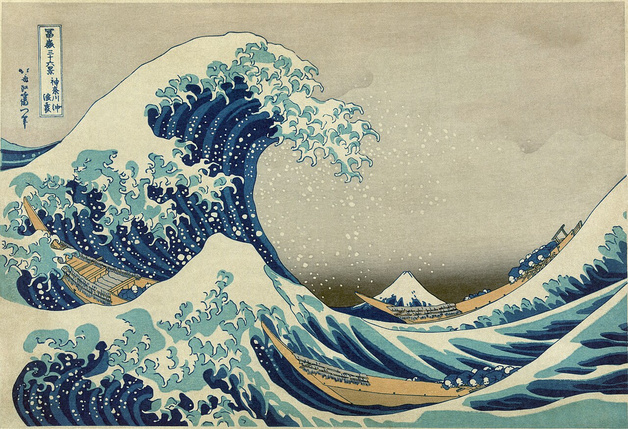
Under the Wave off Kanagawa (The Great Wave), c. 1830–32
Katsushika Hokusai · Polychrome woodblock print
Layered planes at work: the wave's silhouette in the foreground, the empty middle-ground of sea, and Fuji small and pale on the horizon — three distinct worlds stacked into one image.
The Metropolitan Museum of Art · Source
Layering can also be temporal, a concept known as the palimpsest. In the works of Anselm Kiefer, thick layers of straw, lead, and ash are built up and then scraped away, revealing the "ghosts" of previous iterations. This creates a depth that is as much about history as it is about optics. In a digital context, this stratified thinking is native; programs like Photoshop operate entirely on the logic of independent layers that can be made transparent, hidden, or blended. For the artist, the challenge of the layered composition is to decide how these planes interact: do they harmonize, or do they fight? Overlap creates a conceptual connection, suggesting that the thing in front is inextricably linked to the thing it obscures.
Fragments and Juxtapositions
Fragmented composition breaks the picture plane into discontinuous pieces, offering multiple viewpoints or timeframes simultaneously. This is the logic of the collage and the "cut-up." Analytical Cubism, pioneered by Picasso and Braque, shattered the unified perspective of the Renaissance to show the front, side, and top of an object at once. It was an attempt to paint the truth of human perception—that we do not see things from a single frozen point in space, but through a series of glimpses gathered over time.
Fragmentation is also a tool of social and political critique. The Dadaists, such as Hannah Höch, used photomontage to rip images from their original contexts and recombine them into satirical, jarring new realities. By exposing the seams between fragments, these artists called attention to the artificiality of mass media. Similarly, Romare Bearden’s collages of Harlem life used fractured images to speak to the African diaspora and the syncopated rhythms of jazz. In these works, meaning arises specifically from the friction between disparate parts.
The Radiating Center
Radial composition emanates from a central point, creating a powerful sense of focus or explosion. All elements are oriented toward an anchor, whether they are concentrating inward (centripetal) or bursting outward (centrifugal). This structure is archetypal, found in the sacred geometries of the Buddhist mandala and the rose windows of Gothic cathedrals. The center represents the origin, the sacred, or the self, and the radiating patterns symbolize the cosmos or divine light flowing outward to the world.

North rose window, Chartres Cathedral, c. 1235
Unknown master glaziers · Stained glass
A radial composition made theological: light and geometry emanate from a central figure outward through concentric rings, the divine understood as centre from which everything else follows.
Cathédrale Notre-Dame de Chartres · Source
Whether a radial composition is perfectly symmetrical or organic and irregular—like the swirling, emotional vortices of Van Gogh—it dictates a specific psychological response. It can provide a profound sense of stability and meditative equilibrium, or it can feel like a violent detonation. In the land art of Robert Smithson, the spiral becomes a radial journey, extending the viewer’s eye into the environment in a way that suggests growth and eternal return.
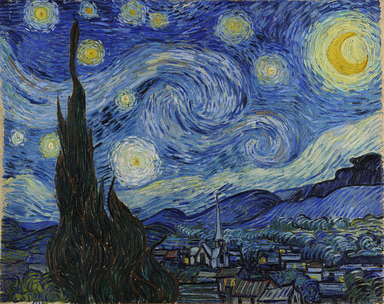
The Starry Night, 1889
Vincent van Gogh · Oil on canvas
Van Gogh's spirals turn the whole sky into a system of radiating centres — the composition is emotional weather rather than a fixed focal point.
The Museum of Modern Art, New York · Source
The Silhouette and the Void
The relationship between figure and ground is the most fundamental transaction in visual perception. Our brains are hardwired to identify "objects" against "environments," a default state that artists can either reinforce or subvert. A clear figure-ground separation serves the needs of communication—it is the mode of the icon, the logo, and the traditional portrait. By maximizing contrast and simplifying the "ground," the artist ensures that the subject is unmistakably dominant.
However, more sophisticated compositions explore the ambiguity of this relationship. In a reversible figure-ground, such as the famous Rubin’s vase, the perception flips between two interpretations, making the viewer an active participant in the creation of the image. The "negative" space is no longer just leftover air but a designed shape with its own agency. Architects and sculptors like Henry Moore understood this deeply; for them, the hole was as important as the mass, and the void was as carefully sculpted as the bronze.
At the extreme end of this spectrum is horror vacui, the fear of empty space. In Islamic tilework or the visionary drawings of Adolf Wölfli, every millimeter of the surface is filled with intricate detail, leaving no room for the eye to rest. This density can be claustrophobic, but it can also be a generous, meditative abundance. In contrast, the strategic use of "breathing room"—associated with the Japanese concept of ma—treats empty space as a presence rather than an absence. This stillness is not "nothing"; it is the potential that allows the figure to exist, a quietude that confers luxury, focus, and clarity upon the few elements allowed to remain. When figure and ground finally interlock so perfectly that they are mutually dependent—as in a jigsaw puzzle or an Escher tessellation—the composition becomes a visual metaphor for interdependence, suggesting that nothing in the visual field can exist without its opposite.

Alhambra-style tile panel, 14th–15th century
Nasrid workshops, Granada · Glazed ceramic mosaic
Horror vacui as devotion, not anxiety: interlocking figures leave no ground, so the whole plane becomes both figure and field at once — the eye can rest anywhere and nowhere.
Los Angeles County Museum of Art · Source
Diagnostic questions, for the work on the table: Where does the eye enter the picture, and where does it come to rest? Is that path something you designed, or something that simply happened? Is the empty space around your subject working as a presence — as ma — or is it merely unused canvas? If you cropped a hand's-width off any edge, would the composition break, or would it barely notice?
Colour in practice
Colour science tells you what colour is — wavelength, cone response, the physics of a sunset. This chapter is about the other question, the one you face at the table with the work in front of you: which colours, how many, and in what proportion.
Start with the uncomfortable truth: no colour is good or bad alone. A colour only behaves in company. The same dusty rose is tender beside a warm grey and lurid beside a green. Josef Albers built an entire pedagogy on this single fact, and you can verify it in five minutes with three scraps of paper. This is why buying "a beautiful colour" solves nothing; you are not choosing colours, you are choosing relationships.
The relationships have names, and the names are worth knowing the way a cook knows salt and acid. Complementary colours sit opposite each other on the wheel — blue and orange, red and green — and vibrate when adjacent; they are the loudest relationship available and should be rationed accordingly. Analogous colours are neighbours — blue, blue-green, green — and give harmony almost for free, at the price of a certain politeness. Temperature cuts across all of it: every palette leans warm or cool, and the lean is usually more legible to a viewer than any individual hue. A picture that cannot decide its temperature reads as noise.
Then there is the decision that matters more than any of these: how many. The historic answer, from Zorn's four-colour palette to risograph printing to the entire tradition of the Japanese woodblock, is fewer than you think. A limited palette is not a hardship; it is a guarantee of harmony, because every mixture shares parent pigments and therefore a family resemblance. Three colours plus white will carry almost any first version of almost any work. If the work later demands a fourth, it will tell you which one — and a colour admitted under pressure earns its place in a way a colour admitted by appetite never does.
Proportion is the last lever, and the least taught. A palette is not a list; it is a budget. The old decorators' rule — roughly sixty, thirty, ten — is crude but points at something real: one colour should govern, one should support, and one should interrupt. Reverse those proportions and the identical three colours produce a different picture. When a palette feels wrong, try redistributing before replacing.
Two failure modes account for most colour trouble. The first is equal saturation everywhere — every hue at full voice, nothing recessive, the visual equivalent of a room where everyone is shouting. Mute most of the palette so one colour can actually speak. The second is borrowed mood: choosing colours for what they mean in the abstract (blue is calm, red is passion) rather than what they do in this picture. Symbolic colour is real — the book returns to it in Content & Meaning — but symbolism will not rescue a relationship that fails optically.
Diagnostic questions, for the work on the table: Which single colour governs, and could a stranger name it? What is the temperature of the whole, in one word? If you removed one colour entirely, which would the picture not miss — and why is it still there?
Balance, tension & negative space
Every composition is a transaction between weight and emptiness. The weights are the marks, figures, and masses; the emptiness is everything you did not touch. Beginners spend their attention on the first and inherit the second by accident. The single largest upgrade available to most early work is to reverse that: design the emptiness on purpose.
Balance is the older idea, and the easier one to misunderstand. Symmetry — the mirrored kind, the cathedral-façade kind — is the strongest stability a picture can have, which is precisely why it reads as sacred, official, or dead, depending on the content it carries. Asymmetric balance is the living alternative: a large quiet mass on one side answered by a small loud one on the other, the way a single dark bird balances an acre of pale sky. Weight, in pictures, is not size. Darkness is heavy. Saturation is heavy. Faces are heaviest of all — a postage-stamp face outweighs a wall of pattern, because the eye cannot decline it.
Tension is balance withheld. Push an element close to an edge without touching it; leave two forms almost aligned; let a diagonal run against the frame. The viewer's eye registers the near-miss and stays alert. Perfect resolution is restful and forgettable; a controlled imbalance is what makes a composition feel about to happen. The judgement — and it is a judgement, renewed in every work — is how much unrest the content can carry. A lullaby and an alarm should not be composed the same way.
Which brings us to the emptiness itself. Negative space is not leftover; it is a set of shapes with exactly as much reality as the positive ones, and it can be well or badly drawn. Look at the sky between two branches, the wall between two figures, the paper inside a letterform: each is a shape you made, whether or not you meant to. The classic exercise — draw the spaces around the chair, never the chair — works because it forces you to see what you actually produced rather than what you intended. And emptiness has cultural weight of its own: the Japanese notion of ma, the interval that gives events their meaning, treats the pause as a positive act, not an absence. A picture with generous, deliberate emptiness says I can afford this. A picture with none says something too — the book takes up horror vacui, the filling of every surface, in its own right — but it should say it on purpose.
Diagnostic questions: Where is the heaviest thing in this composition, and did you put it there or did it just land? Trace the three largest empty shapes with your finger — would you have drawn those shapes deliberately? What is the one near-miss, the one held breath, and does the content deserve it?
Rhythm, pattern & repetition
A single mark is a statement. The same mark twice is a comparison. Three times, and you have made a promise — the viewer now expects a fourth, and everything you do with that expectation is rhythm.
Rhythm in pictures works the way it works in music: repetition establishes the beat, variation keeps it alive, and interruption is the accent that makes both audible. A row of identical windows is a metronome. A row of windows with one shuttered is a sentence. The interval matters as much as the element — evenly spaced repeats read as mechanical and calm; tightening intervals accelerate; a widening gap is a rest, an inhale. You can pace a viewer's eye across a surface as deliberately as a composer paces a bar, and the viewer will feel it without ever naming it.
Pattern is rhythm committed to fully — repetition raised to a field. Here the register shifts. Pattern has carried enormous cultural freight: the interlocking geometries of Islamic tilework, where infinite extension is not decoration but theology; the strip-woven logic of kente; the wallpapers of William Morris; the counted grid of every textile ever made. Western fine art spent a long century calling this work "decorative," a word doing the quiet labour of "minor" and, often, of "women's" and "elsewhere's." That hierarchy has collapsed, and good riddance — but its ghost survives in the reflex to apologise for pattern. Do not apologise. Commit or abstain. A pattern that covers the whole surface is a position; a pattern that peters out at the edges is an accident.
The practical craft of pattern is the management of sameness. Exact mechanical repetition — the stencil, the screen, the tiling algorithm — produces one feeling: cool, industrial, serial. Hand repetition produces another: the ten-thousandth dot differs microscopically from the first, and the accumulation of those differences is warmth, or obsession, or devotion, depending on the work. Agnes Martin's pencilled lines and a sheet of graph paper contain the same geometry and opposite temperatures. Decide which temperature the work requires, then choose the tool that produces it — not the reverse.
And repetition operates at the scale of a practice, not only a picture. Making the same image many times — the series, the suite, the print run of variations — is how sameness teaches you what actually varies. The book returns to this engine in Generative Methods; here it is enough to say that if a motif keeps arriving in your work uninvited, it is not a rut. It is a subject, announcing itself.
Diagnostic questions: What repeats in this work, and after how many repeats does it become a promise? Where is the interruption — the shuttered window — and is it placed or accidental? If the pattern were hand-made, should it be mechanical, and if mechanical, should it be hand-made?
Scale & proportion
Scale is the one formal decision a reproduction cannot preserve, which is why it is the most neglected. On a phone, a six-metre Rothko and a postage stamp are the same size. In the room, they are different species: one you read, the other you enter. Every work has two scales — the size of the object, and the size of everything inside it relative to everything else — and both are arguments.
Start with the object. The reference unit is always the human body, because the viewer brings one to every encounter. Smaller than a hand, a work becomes intimate, private, ownable — the miniature, the icon, the locket; it draws the viewer in to peering distance and makes looking feel like being told a secret. At roughly body size, a depicted figure becomes a counterpart — this is the uncanny charge of the life-sized. Larger than the body, the work stops being an object in your world and starts being a world you are in; monumentality is not grandiosity but a change of relationship, from looking at to standing before. None of these registers is superior. But the register is a decision, and "the canvas I happened to have" is not a reason — it is an abdication.
Inside the work, scale is hierarchy. Whatever is biggest is, to the eye, most important; a picture whose biggest thing is not its most important thing is arguing with itself. This is also where relative scale becomes a tool of meaning rather than mere depiction. Hierarchical scale — the medieval habit of sizing figures by significance rather than distance — was not incompetence but a different priority, and it remains available: make the memory larger than the room it happened in, and the picture says what memory actually does. The reverse move, the sudden miniature — Hokusai's Fuji, tiny beneath the claw of the wave — generates awe by arithmetic alone. Surprise in scale is one of the cheapest and most reliable effects in the entire visual toolkit, and it costs nothing but the nerve to use it.
Proportion is scale's quieter sibling: the ratios inside a form and between forms. Much ink has been spent on golden sections and root rectangles, and you may use them, but hold them loosely — a proportional system is a way of making decisions consistently, not a certificate of beauty, and no viewer has ever loved a picture for its maths. What viewers do feel, acutely, is near-sameness: two shapes almost but not quite equal read as an error, where frankly equal or frankly different read as intent. When in doubt, exaggerate the difference. Timidity, in proportion, is the only real mistake.
Diagnostic questions: If this work were made at half its size, or five times it, what exactly would break — and if the answer is "nothing," why is it this size? What is the biggest thing in it, and is that the most important thing? Where could a violent change of scale do the work a whole paragraph of content is currently failing to do?
Depth & dimension
The history of Western art can be read as a long, fluctuating negotiation with the flat surface of the canvas. For centuries, the primary ambition was to negate that surface, transforming the two-dimensional plane into a transparent window through which a viewer might gaze into a coherent, deep three-dimensional world. Modernism, however, famously broke the glass. It insisted on the honesty of the support, arguing that a painting is, first and foremost, a flat object covered in pigment. To understand depth and dimension in art is to understand the spectrum between these two poles: the meticulous construction of a "fictional" space and the radical embrace of the physical surface.
The Rejection of Illusion
Before the Renaissance codified the mathematics of light and space, Western art was relatively flat. This was not a primitive failure of skill but a deliberate hierarchy of priorities. In Medieval and Byzantine art, the goal was spiritual and symbolic rather than naturalistic. Figures were sized according to their theological importance—hierarchical scale—rather than their position in space. Gold backgrounds functioned as a void of divine light, explicitly rejecting the messy recession of the physical world for a timeless, eternal presence.
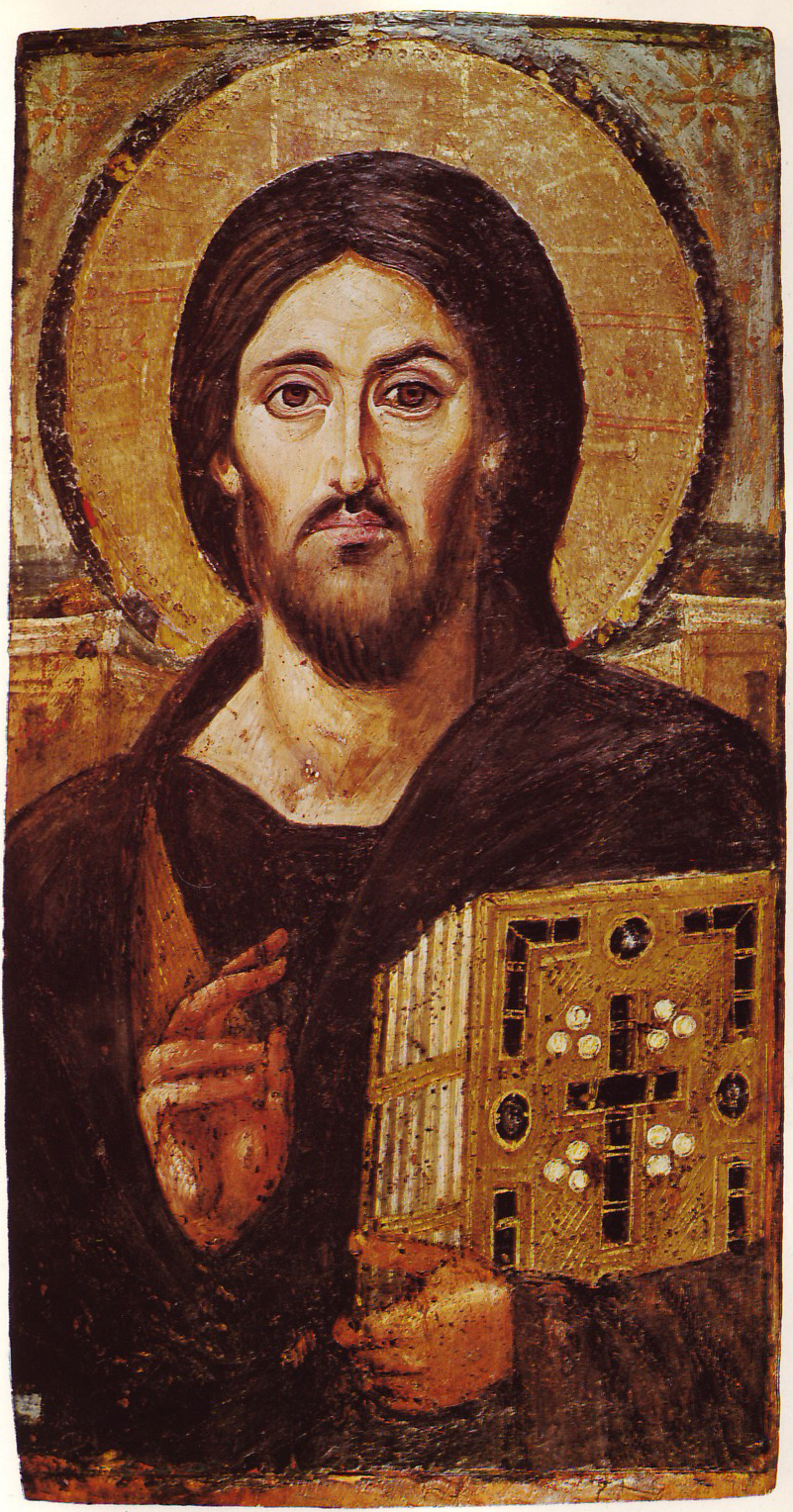
Christ Pantocrator, 6th century
Unknown · Encaustic on panel
Space refused on purpose: a gold void behind the figure declares that theological presence, not spatial recession, is the subject.
Saint Catherine's Monastery, Sinai · Source
Modernism returned to this flatness as a site of radical honesty. Clement Greenberg, the mid-century's most influential critic, argued that the "essence" of painting was its two-dimensionality. For Greenberg, the great sin of Renaissance illusionism was its attempt to imitate the three-dimensionality of sculpture. Artists like Gauguin and Matisse began to collapse the window, moving toward decorative patterning where space was suggested by color rather than perspective. In The Red Studio (1911), Matisse presents a room where chairs, walls, and floors are all the same saturated red; the space is a pattern of shapes rather than a place one could walk into.

The Red Studio, 1911
Henri Matisse · Oil on canvas
Matisse dissolves the room into a single red field. Depth cues survive only as line and colour intervals — the studio has become a pattern rather than a place.
The Museum of Modern Art, New York · Source
The trajectory continued through Cubism, which shattered the single viewpoint, and reached an apex in Minimalism. Frank Stella’s "black paintings" of the 1950s, such as Die Fahne Hoch!, treat the canvas as an object, not a metaphor. "What you see is what you see," Stella famously remarked, asserting that there was no "behind" or "beyond" in his work. Today, this tradition persists in the work of artists like Kerry James Marshall, who employs flat color and compressed space to foreground the political and aesthetic presence of his figures, using flatness as a sophisticated choice to command the viewer’s attention.
Atmospheric and Linear Systems
When an artist chooses to build a deep space, they rely on two primary systems: one based on the physics of the eye, the other on the physics of air. Atmospheric perspective mimics the way air itself creates distance. As objects recede, the intervening atmosphere—filled with moisture and dust—scatters light. In practice, this means distant objects become lighter in value, cooler in color (shifting toward blue), and lose their sharp edges. Leonardo da Vinci mastered this "sfumato," or smoky transition, allowing the mountains behind the Mona Lisa to dissolve into a pale, bluish haze. This system is organic; it creates depth without the rigid geometry of a floor plan, making it the preferred tool for landscape painters from Claude Lorrain to the Hudson River School.

Mona Lisa, c. 1503–19
Leonardo da Vinci · Oil on poplar
Sfumato pushed to its limit: the far mountains lose their edges and cool toward blue-grey, so distance is registered as atmosphere before it is registered as geometry.
Musée du Louvre, Paris · Source
Linear perspective, by contrast, is a mathematical tool of architectural precision. Formalized by Filippo Brunelleschi and Leon Battista Alberti in 15th-century Florence, it posits that all parallel lines converge at a single vanishing point on a horizon line. This creates a powerful, rationalist illusion of depth that places the viewer at a fixed, central point of authority. Raphael's School of Athens is the canonical triumph of this mode, using the surrounding architecture to funnel the viewer’s eye directly toward the central figures of Plato and Aristotle.

The School of Athens, 1509–11
Raphael · Fresco
The canonical demonstration of linear perspective: every architectural line converges on Plato and Aristotle, so the mathematics of the space and the argument of the picture arrive at the same point.
Stanza della Segnatura, Vatican · Source
While most representational art combines both linear and atmospheric systems to achieve maximum realism, they can be separated for different effects. One can have the geometric depth of a hallway (linear) without the hazy color shift of a mountain range (atmospheric), or vice versa. The contemporary digital artist often finds these systems automated in software, yet the "wrongness" of a shadow that is too dark in the distance or a perspective line that misses its mark remains a primary friction in the quest for convincing illusion.
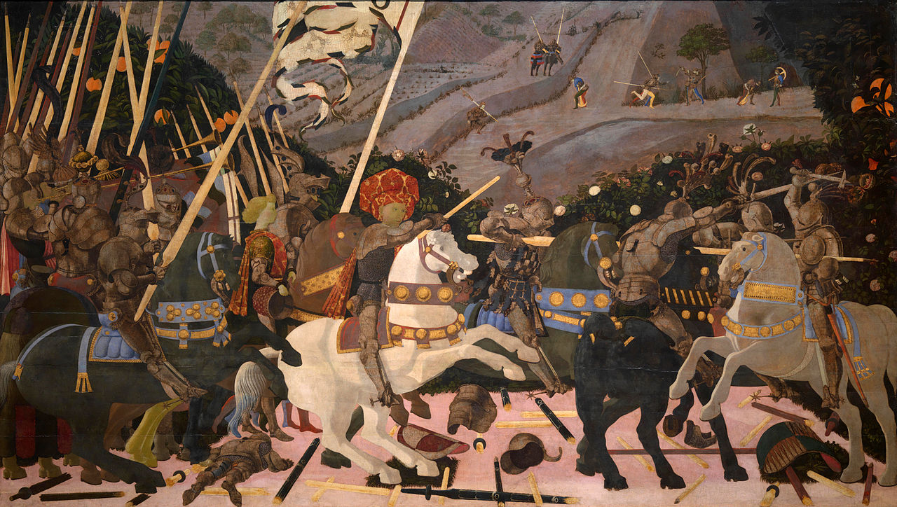
The Battle of San Romano, c. 1438–40
Paolo Uccello · Tempera on poplar
Uccello uses perspective almost as a theorem: broken lances lie on the ground like orthogonals, and the fallen soldier is foreshortened along the same axis — depth argued rather than felt.
The National Gallery, London · Source

Mont Sainte-Victoire and the Viaduct of the Arc River Valley, 1882–85
Paul Cézanne · Oil on canvas
The hinge painting: warm patches advance and cool ones recede, so the mountain sits on the picture plane as much as behind it — perspective giving way to a modern order of colour.
The Metropolitan Museum of Art · Source
Alternative Dimensions
There are, however, spatial logics that do not seek to mimic the human eye. Isometric projection, common in technical drawings and early video games like SimCity, maintains parallel lines that never converge. Because objects do not get smaller as they recede, measurements stay accurate across the entire plane. It feels diagrammatic and systematic—a world seen not by a human observer, but by a god-like surveyor.
Even more radical is reverse perspective, found in Byzantine icons. In this system, lines diverge as they move away from the viewer. The "vanishing point" is not behind the painting, but within the viewer themselves. The objects in the painting—a book held by Christ or a table in Andrei Rublev's Trinity—seem to open outward, projecting the divine presence into the viewer’s space. It is an invitation rather than a window.

The Trinity, c. 1411 or c. 1425–27
Andrei Rublev · Tempera on panel
Reverse perspective as invitation: the table opens outward rather than receding, so the vanishing point sits with the viewer and the three angels lean toward, not away from, the person praying.
Tretyakov Gallery, Moscow · Source
Whether through the "push and pull" of a Hans Hofmann abstraction, the impossible geometries of M.C. Escher, or the stark, flat UI of a modern smartphone, the artist’s treatment of the third dimension is never a neutral act. It is a decision about where the viewer stands: whether they are a passive observer looking through a window, a technician reading a diagram, or a participant confronted by a flat, unyielding reality.
Diagnostic questions, for the work on the table: Look at the space you have built — is the viewer invited to step inside it, or are they held at the surface? If the space recedes, does it recede through geometry (converging lines, overlap) or through atmosphere (softening edges, cooling colour)? And is the flatness or depth of your picture a decision, or a default of the medium you happen to be using?
Sources & further reading
For the shelf beside this part
Entries marked ⚑ anchor specific contested or checkable claims in the text.
Art and Visual Perception (1954; rev. 1974) — Rudolf Arnheim
The standard account of visual weight, balance, and composition as perception.
Interaction of Color (1963) — Josef Albers
The demonstration, not just the claim, that colour is relational.
The Art of Color (1961) — Johannes Itten
The Bauhaus colour-contrast system this part's chapter compresses.
Picture This: How Pictures Work (1991) — Molly Bang
The shortest good book on composition ever written.
Point and Line to Plane (1926) — Wassily Kandinsky
Form as inner necessity, from the source.