Part 03 · Field Book
Scientific Lenses
Why images work — attention, Gestalt, colour physics, neuroaesthetics, nature's geometry.
To study the mechanics of sight is not to explain away the mystery of a masterpiece, but to identify the physical constraints within which that mystery must operate. This inquiry moves through the hard physics of light and the biological imperatives of the nervous system, tracing the path from the initial twitch of optic nerve salience to the complex cognitive harmonies of the Gestalt. By examining how the brain parses pattern, color, and natural geometry, we begin to see the work of art less as a static object and more as a sophisticated machine designed to interface with the specific, evolved architecture of the human mind.
In this part · 6 chapters
Attention & salience
Human perception is not a passive recording of the world, but a ruthless filtering process. To look at a canvas is to enter a theater of competition where different elements vie for the limited resource of the viewer’s attention. We do not attend to everything simultaneously; rather, we navigate a visual field through a two-fold system of selection. The first is raw, stimulus-driven, and pre-conscious—a biological legacy that prioritizes certain signals above all others. The second is voluntary and goal-oriented, filtered through the sieve of our own intentions and cultural knowledge.
This primary, involuntary mechanism is often termed bottom-up attention. It is the "pop-out" effect that occurs when a single red circle sits among a field of blue ones. No cognitive effort is required to find it; it asserts itself. This salience is driven by a specific set of visual hierarchies that are, in many ways, evolutionary. High contrast, saturated colors (particularly reds and oranges), and motion—or the suggestion of it—are hard-wired to capture the eye. We are also biologically predisposed to seek out faces. The human brain is so finely tuned for face detection that a portrait will almost always win the battle for attention against a landscape of equal scale.

Girl with a Pearl Earring, c. 1665
Johannes Vermeer · Oil on canvas
Bottom-up attention in one image: dark ground, high value contrast, a single specular highlight on the pearl, and — most of all — a face turning toward the viewer. The eye has nowhere else to go.
Mauritshuis, The Hague · Source
In practice, an artist’s mastery of these bottom-up triggers determines the work’s focal hierarchy. A successful composition guides the gaze strategically—usually starting with a lone, isolated element or a sharp shift in value—and then allows it to migrate toward secondary areas of interest. The danger lies in "predictable salience," where the loudest element is always the most important, or "multiple focal points," where everything shouts with equal volume. When every corner of a masterpiece demands the same level of attention, the result is not richness, but a visual static that causes the viewer to disengage.
Counterposed to this is top-down attention, which is intellectual and intentional. This is the search for the arrow hidden in the FedEx logo; once the viewer is aware of its existence, the "knowledge" of the symbol overrides the raw geometry of the letters. We see what we expect to see. A viewer standing before a 17th-century Dutch landscape will instinctively scan the horizon because they understand the genre’s rules. Here, meaning becomes a magnet.
However, the focus required for top-down tasks can lead to a phenomenon known as inattentional blindness. In the famous 1999 experiment by Simons and Chabris, participants counting basketball passes completely failed to notice a man in a gorilla suit walking through the frame. Their attention was so precisely calibrated to the task that the unexpected became invisible. In art, this allows for the "delayed revelation"—the hidden detail or subtle subversion that rewards the viewer who stays a moment longer. It is the sophisticated play between what is immediately salient and what is eventually discovered that gives a work its psychological depth.
Pattern and Projection
Closely related to how we direct our focus is how we make sense of the chaos once we have found it. The human brain is an inveterate seeker of patterns, a trait best exemplified by pareidolia—the tendency to perceive meaningful images, particularly faces, in random stimuli. We see the Virgin Mary in a charred piece of toast or a glowering countenance in the facade of a building because our face-detection systems are "hot"; the threshold for a match is low.
Artists have long exploited this tendency to bridge the gap between abstraction and representation. In the Rorschach-like marks of Abstract Expressionism or the vegetable-portraits of Giuseppe Arcimboldo, the work functions as a prompt for the viewer’s own internal "template matching." We possess mental archetypes for trees, bodies, and letters, and we will impose these templates onto the most minimal of marks.
This leads to the cognitive economy of pattern completion. Just as one can read a sentence with most of its vowels removed, a viewer can reconstruct a solid form from a few fragmented strokes of an Impressionist brush. The brain fills the gaps based on expectation. When an artist leaves the right amount of information out, they invite the viewer to finish the work, creating a more intimate, participatory experience.
The risk in this transaction is two-fold: unintentional pareidolia and the limits of cultural legibility. An abstract painter may inadvertently create a "face" in the corner of a composition that distracts from their intended formal goals. Furthermore, not all patterns are universal; templates for symbolic meaning are often culturally bound, and what reads as a clear signal to one audience may be mere noise to another. The most effective work resides in the tension between the familiar and the broken—establishing a pattern only to interrupt it, thereby forcing the brain out of its comfortable, automatic processing and back into a state of active, conscious seeing.
Diagnostic questions: Turn your back to your work, take a breath, and spin around to look at it for exactly one second. Where did your eye go first? Was it drawn by a face, by high contrast, or by saturated colour? Is that spot actually the most important part of the piece, or is it just the loudest?
Gestalt principles
Perception is not a passive reception of data; it is a construction of the mind. In the early twentieth century, the Berlin school of Gestalt psychology—pioneered by Max Wertheimer, Kurt Koffka, and Wolfgang Köhler—shifted the conversation of perception from the mechanical to the holistic. The German word Gestalt translates poorly to a single English equivalent, but it implies a configuration or a unified whole that is fundamentally different from the sum of its parts. The brain does not simply see a collection of lines and dots; it sees a face, a tree, or a horizon. It is an organ of order, constantly filtering the chaos of the sensory world through a set of subconscious "laws" designed to create meaning out of ambiguity.
The Economy of Form
At the heart of this system lies the Law of Prägnanz, or the principle of simplicity. The human mind is cognitively frugal; when faced with a complex or ambiguous set of visual stimuli, it will invariably default to the simplest, most stable interpretation possible. This is a quest for "good form." We see the five Olympic rings not as a jigsaw of irregular, interlocking crescent shapes, but as five perfect circles overlapping in space. The brain prefers the regularity of the circle—a shape that represents stability and closure—over the fragmented geometry actually present at the intersections.
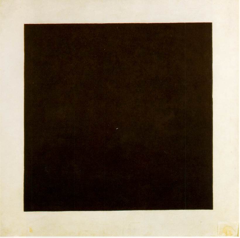
Black Square, 1915
Kazimir Malevich · Oil on linen
Prägnanz at the limit: a shape so reduced that perception has almost nothing left to organise, which is precisely why the mind reads it as monumental rather than empty.
Tretyakov Gallery, Moscow · Source
This pursuit of simplicity is why certain logos, such as the Nike swoosh or the Apple silhouette, achieve a near-universal legibility. They satisfy the Law of Prägnanz by providing the mind with a form so stable and reduced that it requires almost no processing power to identify. In contrast, the Necker cube—a wireframe drawing—creates a state of perceptual tension because it offers two equally simple interpretations of its orientation. The brain cannot settle; it oscillates between the two, illustrating that while we crave stability, we are also at the mercy of how our minds choose to resolve a three-dimensional logic on a two-dimensional plane.
Principles of Grouping
Beyond the individual form, the brain seeks to organize the entire visual field into coherent groups. The primary tools for this organization are similarity and proximity. The Law of Similarity dictates that we perceive elements sharing characteristics—color, shape, size, or orientation—as belonging to a single unit. It is worth noting that there is a hierarchy to this perception: color is the most dominant grouping force, often overriding shape. A field of red circles and red squares will be perceived as a unified scarlet mass long before the mind begins to differentiate between the curved and the angular.
The Law of Proximity operates with similar efficiency. Elements that are physically close to one another are instinctively grouped, a phenomenon that underpins the architectural logic of layout and typography. In the gutter of a comic book, proximity even dictates our sense of time; panels placed closely together suggest a rapid succession of moments, while wider gaps imply a more significant temporal leap.
However, these groupings can be subverted. The Law of Common Region demonstrates that we can override proximity by drawing a boundary. A simple box around two distant elements will override the fact that they are far apart, forcing them into a relationship. Similarly, the Law of Continuity suggests that the eye prefers to follow a smooth path rather than an abrupt one. When two lines intersect, we do not see four segments meeting at a point; we see two continuous journeys passing through one another. This principle allows the artist to guide the viewer’s eye through a composition as if on a rail, using implied lines and rhythmic repetitions to dictate the sequence of the gaze.
The Collaborative Eye
The most sophisticated of these principles is the Law of Closure—the mind’s tendency to complete a fragmented figure. This is an act of participatory perception. In the famous WWF panda logo, there are no lines defining the top of the head or the back, yet the brain "draws" these boundaries to resolve the black shapes into a creature. This creates a sense of intellectual satisfaction; the viewer is not merely a recipient of an image but a collaborator in its creation.
The degree of closure required is a lever of engagement. A nearly complete form provides effortless elegance, while a severely fragmented one creates tension and mystery, forcing the viewer to work for the resolution. This is closely related to the Law of Common Fate, which, in a static image, is expressed through implied motion. When elements align along a shared diagonal or point in a common direction, they are perceived as a unified force, a troupe of actors moving toward a single destination.
Finalizing this perceptual architecture is the relationship between figure and ground. The brain has a distinct "convexity bias," preferring to assign the status of "object" to bulging, outward forms while relegating concave shapes to the background. In a successful composition, this hierarchy is usually clear, providing a stable focal point. Yet, there is a particular pleasure in the multistable image—those instances where figure and ground carry equal weight, as in the tessellations of M.C. Escher. In these moments, the brain’s machinery is laid bare, caught in a perpetual loop of re-evaluation, reminding us that what we "see" is as much a product of our neural shortcuts as it is of the light hitting our eyes.
Diagnostic questions: Apply the law of closure to your current work. Have you explained everything, or have you left a gap for the viewer's brain to bridge? Where can you remove a line, a transition, or a passage of detail and let the viewer's mind do the work of connecting the dots?
Optical phenomena & illusions
The fundamental tension of visual art lies in the gap between the physical reality of the object and the neurological reality of the observer. We rarely see what is actually there; instead, we see what the brain tells us is there. Optical illusions are not merely parlor tricks or glitches in the system; they are revelations of the mechanics of sight. By studying where the eye fails or where the brain overcompensates, the artist gains a set of tools for intentional perceptual manipulation.
The Relativity of Color and Edge
Perhaps the most persistent deception in visual experience is the illusion of absolute color. Simultaneous contrast dictates that a color’s identity is entirely dependent on its neighbor. A neutral gray square, when placed against a stark white field, will appear somber and shadowed; the same gray, transposed onto a black background, suddenly glows with a silvery luminosity. The eye does not measure absolute values; it measures the difference between adjacent areas.
Josef Albers spent decades documenting this instability in his Homage to the Square series. By nesting squares of different hues and values, Albers demonstrated that color is a relational language rather than a collection of fixed nouns. A deep ochre might appear muddy and brown next to a vibrant yellow, yet the same ochre will sing with a golden light when bordered by a cool violet. This is the physiological basis for color harmony: to make a dull color appear vibrant, one does not necessarily change the paint, but rather shifts the background toward a complementary hue.
This system of retinal comparison extends to the very edges of objects through a phenomenon known as Mach bands. At the boundary where a light tone meets a dark one, the brain performs a feat of "edge enhancement." It perceives a thin, luminous stripe on the light side and a deeper shadow on the dark side, even if the physical pigment is perfectly uniform. This is the result of lateral inhibition—a process where stimulated neurons inhibit their neighbors to sharpen the transition between shapes. For the painter, understanding Mach bands is an exercise in restraint; one must resist the urge to over-emphasize highlights at an edge, lest the brain’s natural sharpening effect combine with the paint to create an unnaturally strident, "cut-out" appearance.
Fatigue and Vibration
The eye is a living organ subject to exhaustion. When we stare at a saturated color for an extended period, the specific retinal cones responsible for that hue—whether red, green, or blue-sensitive—begin to fatigue. When we finally look away at a white surface, those tired receptors under-respond, allowing their rested counterparts to dominate the field of vision. The result is an afterimage in the complementary color.
This retinal fatigue was not lost on the Impressionists, who noticed that staring at lush green foliage would eventually tint the horizon with a spectral pink. In the 1960s, the practitioners of Op Art, such as Bridget Riley and Victor Vasarely, pushed this physiological quirk to its limit. By placing high-contrast, complementary colors in tight, repetitive patterns, they induced a state of retinal competition. The eye, unable to settle as it tires of one hue and recovers with the other, perceives a shimmering "vibration." This is not a property of the canvas but a performance occurring entirely within the viewer’s nervous system. While such effects can generate immense energy, they also carry a warning: the same mechanisms that produce aesthetic vibration can lead to physical discomfort or nausea if the visual system is pushed too far.
The Architecture of Impossibility
If color illusions exploit the retina, spatial illusions exploit the mind's desire for a coherent world. Our perceptual system is hardwired to translate two-dimensional information into three-dimensional logic by scanning for cues like depth, occlusion, and perspective. The "impossible object"—the Penrose triangle or the endless stairs of M.C. Escher—works by providing local consistency while maintaining global contradiction.

The Drawbridge, from Carceri d'invenzione, 1749–1761
Giovanni Battista Piranesi · Etching
Two centuries before Escher, Piranesi assembles staircases and drawbridges that each look locally plausible while the whole architecture refuses to reconcile — an eighteenth-century catalogue of the impossible object.
Various collections; plate widely reproduced · Source
In Escher’s Ascending and Descending, each individual staircase and figure appears logically sound in its immediate context. It is only when the viewer attempts to reconcile the entire structure that the paradox emerges: the figures are forever climbing yet never rising. This tension between the "part" and the "whole" allows the artist to create a dreamlike, surrealist atmosphere, as seen in the work of René Magritte or Salvador Dalí. By manipulating local cues and hiding critical junctions, the artist forces the viewer into a state of cognitive dissonance, where the eye sees a form that the mind knows cannot exist.
Context and Scale
The perceived size of an object is similarly compromised by its surroundings. The Ebbinghaus illusion proves that our sense of scale is entirely contextual; an identical circle appears diminished when surrounded by larger shapes and monumental when surrounded by tiny ones. This is the root of "forced perspective" in architecture and cinema, where objects are scaled and positioned to suggest a depth or grandeur that is physically absent.
Similarly, the Ponzo illusion demonstrates how the brain prioritizes depth cues over raw sensory data. When two identical lines are placed within converging tracks, the brain interprets the convergence as linear perspective. Because the upper line appears "farther" away, the brain concludes it must be "larger" to occupy the same amount of space on the retina. These distortions remind us that the viewer’s eye is not a camera, but an interpretive engine. The artist who masters these lenses does not just record the world; they navigate the complex, often unreliable machinery of human consciousness.
Diagnostic questions: Squint at your work until the detail collapses. What still holds — a value structure, a colour vibration, an afterimage? If nothing survives the squint, the picture is relying on information the eye discards before it reaches meaning.
Colour science
The physical reality of color is a ghost. In the material world, there are no hues, only a chaotic sea of electromagnetic radiation. What we experience as a vibrant "red" apple is merely a surface reflecting light between 620 and 700 nanometers while absorbing the rest of the spectrum. The color itself is a pre-verbal construct of the nervous system—a perceptual shorthand for specific wavelengths. When we study the science of color, we are not just studying light; we are studying the intersection of physics and biology, an understanding of which allows an artist to move beyond intuitive guesswork toward a more sophisticated command of the viewer’s eye.
Light and the Mechanism of Vision
Visible light occupies a remarkably narrow band of the electromagnetic spectrum, sandwiched between the invisible heat of infrared and the ionizing energy of ultraviolet. Within this tiny window, the brain assigns a specific character to each wavelength: the short, high-energy vibrations are perceived as violet, while the long, low-energy waves are seen as red. This is the "spectral" reality—the pure rainbow colors identified by Newton in 1666 when he used a prism to shatter white sunlight into its constituent parts.
Beyond these, there exists the realm of the non-spectral: colors like magenta, brown, and grey. These do not exist as single wavelengths in the rainbow; they are sophisticated interpretations the brain manufactures when it receives a mixture of disparate signals. A magenta, for instance, is the brain’s attempt to reconcile the simultaneous detection of short-wave blue and long-wave red light.
This distinction between objective wavelength and subjective experience is the foundation of the artist's craft. It explains why a painting’s character shifts under different illuminations—a phenomenon known as metamerism. Two pigments that appear identical under the fluorescent light of a studio may diverge sharply when viewed in natural daylight. This happens because the human eye is trichromatic, relying on three types of cones (L, M, and S) to translate light into signal. Because the brain is forced to "average" these signals, vastly different spectral reflectance curves can produce the same perceived color. For the practitioner, this means that color matching is never an absolute science, but a negotiation with the specific qualities of a light source.
Additive and Subtractive Systems
In the modern world, the artist must fluctuate between two diametrically opposed systems of color mixing: the additive and the subtractive. The confusion between them is a common source of technical failure, yet the logic of each is internally consistent.

Farbenkreis (colour wheel from the Theory of Colours), 1809
Johann Wolfgang von Goethe · Watercolour diagram
Colour theory as a moral diagram: Goethe organises the spectrum into a circle of complementary pairs, then attaches each wedge to a temperament of mind — physics and psychology treated as the same subject.
Freies Deutsches Hochstift, Frankfurt · Source
Additive color is the logic of light. It is the language of the screen, the projector, and the stage lamp. Here, the primary colors are Red, Green, and Blue (RGB), which correspond directly to the three cone types in the human retina. In this system, color is built by adding energy. Combining all three primaries at full intensity produces pure white light; the absence of light is black. If you overlap a red beam with a green one, the result is yellow—a result that seems counterintuitive to anyone trained exclusively in physical media but which follows the fundamental physics of the visual system.
Subtractive color is the logic of the material. It governs paint, ink, and dye. In this realm, color is created not by adding light, but by taking it away. A cyan pigment appears cyan precisely because it is an "energy thief"—it absorbs long-wave red light and reflects only the remaining blue and green. Therefore, mixing pigments is a cumulative process of subtraction; the more you mix, the more light is absorbed, and the closer the result crawls toward a muddy black. While traditional art education often cling to the historical Red-Yellow-Blue (RYB) model, modern color science identifies Cyan, Magenta, and Yellow (CMY) as the true subtractive primaries, offering a far more accurate range of reproduction, as evidenced by the CMYK process used in industrial printing.
Temperature and Structure
The concept of color temperature introduces a curious paradox between physical fact and psychological association. In physics, the color of a "blackbody" radiator—such as a star or a heated iron bar—shifts as it gets hotter, moving from a low-energy dull red to a high-energy blue-white. Thus, physically speaking, blue light (10,000K) is much "hotter" than orange light (3,000K).
However, the human psyche reverses this. We associate the orange of a hearth fire or a sunset with warmth, and the blue of a clear sky or deep shadows with cold. The Impressionists were among the first to exploit the reality beneath this psychological veil, noting that on a sunny day, the sunlit areas are relatively "warm" (lower K), while the shadows, illuminated by the high-temperature blue light of the sky, are decidedly "cool." Mastering these temperature contrasts allows a painter to create the illusion of atmospheric depth without relying solely on value or saturation.
Finally, we must account for those colors that do not rely on pigments at all. Structural color—as seen in the iridescent wing of a Morpho butterfly, the "play-of-color" in an opal, or the shimmering surface of a bubble—is the result of microscopic physical architectures that interfere with light waves. Unlike a pigment, which absorbs light uniformly, structural colors shift and "flip" depending on the angle of the observer. They represent a rare moment where the physical geometry of an object, rather than its chemical makeup, dictates its appearance. While traditional pigments struggle to replicate this angle-dependent shimmer, the modern artist can simulate it through the use of interference paints or multi-layered glazes, acknowledging that some of the most profound effects in nature are not about what a surface is, but how it fragments the light falling upon it.
Diagnostic questions: Take your work out of the studio. Look at it under fluorescent light, under the warm glow of a tungsten lamp, and in direct midday sun. How does metamerism change the relationships between your colours? Which light source is this work actually built for — and does the viewer know?
Neuroaesthetics
Neuroaesthetics, an emerging synthesis of neuroscience, psychology, and art theory, seeks to map the neural architecture of the aesthetic experience. Since its inception in the late twentieth century, the field has moved beyond mere speculation, using functional Magnetic Resonance Imaging (fMRI) to observe the brain as it encounters beauty. What these studies reveal is that art is not a peripheral luxury of human cognition but is deeply integrated into the same reward pathways that govern our most fundamental biological drives. When we stand before a work that moves us, the brain’s ventral tegmental area and nucleus accumbens—the seats of dopamine production—fire in a manner remarkably similar to their response to food, social bonding, or narcotics.
One of the most provocative concepts in this field is the peak shift effect, popularized by V. S. Ramachandran. This principle suggests that the brain responds more vigorously to exaggerated versions of recognizable stimuli than to the stimuli themselves. It explains why a caricature is often more instantly recognizable than a photograph, or why we find the elongated figures of Modigliani or the fractured, heightened features of a Picasso portrait so arresting. By identifying and amplifying the "essence" of a subject, the artist creates a super-stimulus that triggers a stronger neural response than reality ever could.
This engagement is not merely optical; it is embodied. Through the discovery of mirror neurons—cells that fire both when we perform an action and when we observe someone else doing so—we understand that viewing art is a form of internal simulation. When one looks at the aggressive, visceral drips of a Jackson Pollock or the thick, labored impasto of a Lucian Freud, the brain subconsciously reenacts the physical pressure and momentum of the artist’s hand. The viewer does not just see the mark; they "feel" the gesture. This suggests that the power of a line is rooted in the perceived confidence or sensitivity of the body that produced it.
Fluency and the Architecture of Attention
Central to our aesthetic judgment is the principle of processing fluency: the ease with which the brain can decode a visual stimulus. Evolutionarily, the brain equates ease with safety and familiarity, leading to a natural preference for symmetry and high contrast. Symmetry acts as a cognitive shortcut, allowing the brain to predict one half of an image based on the other, thereby reducing the mental energy required for processing. This explains the near-universal appeal of bilateral forms, from classical architecture to the mandala. Similarly, the "mere exposure effect" demonstrates that the more we encounter a visual style, the more fluent our processing becomes. The avant-garde works that baffled audiences in 1907, such as Cubist experiments, eventually became pleasurable as the collective cultural brain learned the visual language necessary to decode them.
However, a tension exists between this desire for fluency and the need for complexity. While high fluency offers immediate pleasure, it risks becoming decorative or dull. Conversely, low fluency—characterized by asymmetry, ambiguity, and unfamiliar content—demands more cognitive "heavy lifting." The most enduring works of art often inhabit a "sweet spot" of moderate fluency, offering enough order to be comprehensible but enough complexity to reward sustained attention. By strategically introducing disfluency, an artist can force the viewer to work harder, leading to a deeper sense of accomplishment and reward once the image is finally "solved."
The brain’s attention is further guided by a salience map, an internal hierarchy that highlights regions of high contrast, motion, and human faces. This is partly a bottom-up, evolutionary mechanism; our eyes are biologically programmed to prioritize faces and sharp tonal shifts. Yet, this is balanced by top-down attention, where the prefrontal cortex directs our gaze based on our specific intentions or knowledge. Artists manipulate this hierarchy through composition, ensuring that the viewer’s eye follows a predetermined path, fixating on the most meaningful content while drifting past the subordinate background.
Prediction and Universalism
Beyond the mechanics of vision, neuroaesthetics considers the brain as a "prediction engine." As proposed by theorists like Karl Friston, the brain does not passively record the world but constantly generates hypotheses about what it expects to see. Aesthetic delight often arises from "prediction errors"—moments where our expectations are subverted in a way that feels meaningful rather than chaotic. René Magritte’s The Treachery of Images is a masterclass in this subversion: by pairing a realistic painting of a pipe with the text "This is not a pipe," he violates our linguistic and visual expectations, forcing a pleasurable cognitive recalibration.

Vertumnus (portrait of Emperor Rudolf II), c. 1591
Giuseppe Arcimboldo · Oil on panel
A trained prediction — the brain's certainty that it is looking at a face — collides with the correct one that these are pears and pea pods. The pleasure of the picture is the small cognitive jolt as the two readings swap.
Skokloster Castle, Sweden · Source
This neurological framework also helps us distinguish between universal human responses and cultural specificities. Certain aesthetic preferences appear to be hard-wired: infants across all cultures prefer curves over jagged angles, and Paul Ekman’s research famously demonstrated that basic facial expressions of emotion—fear, disgust, joy—are recognized across many cultures, though the strong universalist claim is contested by constructionist accounts of emotion. These are the tools of the "universal" artist. Yet, these biological foundations are always draped in cultural meaning. While a red hue may trigger a universal state of high arousal and amygdala activation, its symbolic meaning—be it "danger" in the West or "luck" in China—is a learned association. The most sophisticated art often layers these two levels, utilizing universal biological triggers like symmetry and facial expression to anchor more complex, culturally specific narratives.
Diagnostic questions: Show the work to someone for three seconds, then take it away. What do they remember — a shape, a colour, a feeling, nothing? The trace it leaves in memory is closer to what the work is than anything they'd say while looking at it.
Biomimicry & natural patterns
Nature organizes itself through a series of physical imperatives—evolutionary optimization, mathematical growth rules, and the cold logic of resource distribution—that happen to produce what we recognize as beauty. To study these patterns is not merely to copy the outward appearance of a leaf or a river delta, but to understand the underlying grammar of efficient form. Any artist seeking to imbue their work with a sense of "organic" vitality must eventually contend with these systems, for they represent the visual language of life itself.
The Logic of Recurrence
One of the most profound structures in the natural world is the fractal, a pattern that exhibits self-similarity across different scales. Whether one zooms in or out, the complexity remains consistent, as the part reflects the whole. While mathematicians like Benoit Mandelbrot explored this through infinite iterative functions, nature provides more tangible, approximate examples. Consider the Romanesco broccoli: a logarithmic spiral where each floret is a miniature version of the entire head, and each sub-floret a miniature of that. A similar recursion governs the architecture of ferns, the forkings of a lightning bolt, and the dendritic sprawl of a river system.
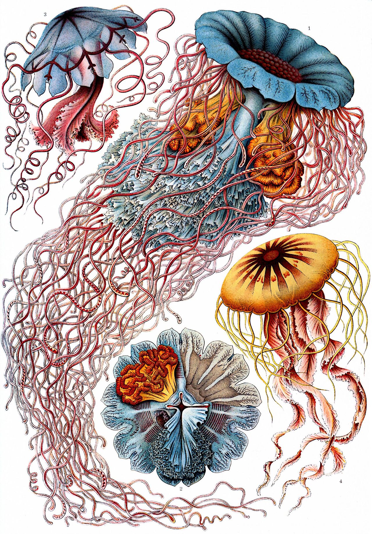
Discomedusae, Plate 8 from Kunstformen der Natur (Art Forms in Nature), 1904
Ernst Haeckel · Chromolithograph
Natural-history illustration used as a compositional argument: Haeckel arranges jellyfish by their symmetries so that the biology and the ornament are the same subject on the page.
Various natural history collections · Source
In biology, this is rarely a matter of aesthetics; it is a matter of surface area. The human lung branches from bronchi down to microscopic bronchioles to maximize the surface area for oxygen exchange within the cramped volume of the chest. The aesthetic appeal of these forms, however, appears to be deeply rooted in our cognitive evolution. The physicist Richard Taylor famously analyzed Jackson Pollock’s drip paintings and discovered they possessed a specific "fractal dimension"—a numerical measure of complexity. His research suggested that humans show a marked preference for a moderate fractal dimension, roughly 1.3 to 1.5, which happens to be the same range found in most natural landscapes. We seem to be wired for the complexity of the woods rather than the blankness of a desert or the noise of a static-filled screen.
Parallel to the fractal is the presence of the Fibonacci sequence and the Golden Ratio ($\varphi$). This mathematical sequence—where each number is the sum of the two preceding it—manifests with startling frequency in the phyllotaxis of plants. The arrangement of seeds in a sunflower or the scales of a pine cone often follows Fibonacci numbers because this specific "golden angle" allows for the most efficient packing of elements without gaps or wasted space. While art history has often retrofitted the Golden Ratio onto masterpieces like the Mona Lisa or the Parthenon with a zeal that borders on the superstitious, the ratio remains a valid compositional tool. It offers a way to divide a canvas that feels "earned" by the logic of growth rather than imposed by arbitrary whim.

Chambered nautilus shell compared with a logarithmic spiral, Contemporary photograph and diagram
Nature; diagram by Chris 73 (Wikimedia Commons) · Photograph with overlaid mathematical spiral
The mathematics is not imposed on the shell; it is the shell. Biomimicry begins in noticing that the natural form and its equation are the same object.
Wikimedia Commons · Source
Symmetry and Territorial Division
Nature’s use of symmetry is perhaps the most immediate way it signals intention. Bilateral symmetry—the mirror image of the left and right—is the hallmark of the hunter and the hunted. It facilitates directional movement and balanced locomotion, creating a sense of formal, stable authority that we recognize in the human face. Radial symmetry, conversely, is the domain of the sessile or the slow-moving, such as the starfish or the anemone. It allows an organism to sense and feed in all directions equally. In composition, perfect symmetry can feel static, even deadening; the most compelling works often utilize "approximate" symmetry, where a slight deviation or break in the mirror image activates the viewer’s eye, providing just enough tension to suggest life.
Where symmetry deals with balance, tessellation and Voronoi patterns deal with the problem of space-filling. Nature is famously loath to leave a vacuum, and it fills planes using a limited set of geometric solutions. The hexagon is the gold standard of efficiency; it is the only shape that tessellates (fills a plane without gaps) while offering the highest area-to-perimeter ratio. Bees did not "invent" the hexagon for their honeycombs out of an artistic preference; they evolved to use the least amount of wax for the maximum amount of honey storage. Similar hexagonal patterns emerge in the cooling of volcanic rock at the Giant’s Causeway, where thermal contraction cracks meet at 120-degree angles to minimize energy.
Voronoi patterns represent a more irregular, organic method of subdivision. In a Voronoi diagram, a space is divided into regions based on their proximity to specific "seed" points. Every point within a cell is closer to its own seed than to any other. This is the logic behind the spots on a giraffe, the veins in a dragonfly’s wing, or the way corn kernels crowd together on a cob. It is a visual record of competition for territory. When an artist employs Voronoi-like structures, they move away from the rigid grid of the machine toward a cellular, biological aesthetic that feels both chaotic and deeply organized.
Dendritic Networks and Growth
Finally, we find the branching, or dendritic, pattern—perhaps the most ubiquitous structure in the physical world. Whether we look at the path of least resistance taken by an electrical discharge or the nutrient-seeking sprawl of a tree’s root system, the logic remains the same: the distribution of resources from a single source to a vast periphery. Leonardo da Vinci noted that the total cross-sectional area of a tree’s branches is equal to the cross-sectional area of the trunk, a precursor to modern observations like Murray’s Law, which explains how our circulatory systems minimize the energy required to pump blood.
For the artist, these branching systems provide a ready-made armature for composition. A work organized around a dendritic flow—where major elements lead the eye toward increasingly fine detail—mimics the way we process information through our own neurons, which are themselves dendritic structures. By incorporating these scientific lenses—the fractal, the golden spiral, the Voronoi cell—the artist does not merely decorate a surface. They tap into the fundamental protocols of the physical world, creating work that resonates because it follows the same laws as the viewer's own body.
Diagnostic questions: Look at your composition as a pattern of branching, spiralling, or packing. Which natural system is it closest to — a river delta, a sunflower head, a cracked mud flat? If the answer is 'none,' is that a deliberate refusal of natural order, or an accidental one?
Sources & further reading
For the shelf beside this part
Entries marked ⚑ anchor specific contested or checkable claims in the text.
Vision and Art: The Biology of Seeing (2002) — Margaret Livingstone
The most reliable bridge between neuroscience and pictures.
Gorillas in Our Midst (Perception 28, 1999) — Daniel Simons & Christopher Chabris
The inattentional-blindness study cited in the attention chapter.
Fractal Analysis of Pollock's Drip Paintings (Nature 399, 1999 / Nature 444, 2006) — Richard Taylor et al. / Jones-Smith & Mathur
Cite both; the fractal-Pollock claim is contested.
The Free-Energy Principle: A Unified Brain Theory? (Nature Reviews Neuroscience 11, 2010) — Karl Friston
The predictive-processing framework, offered here as hypothesis, not settled fact.
How Emotions Are Made / Psychological Bulletin 115 (2017 / 1994) — Lisa Feldman Barrett / James Russell
The constructionist critique of Ekman's universality thesis referenced in neuroaesthetics.
The Science of Art (Journal of Consciousness Studies 6, 1999) — V.S. Ramachandran & William Hirstein
Influential, speculative, and best read as such.